Hey Cloggers,
I’m back with my recap of my free inquiry blog and I’m excited to be sharing my learning experiences with you all!
As you already know, I did my inquiry assignment on calligraphy and lettering. Here is a refresher of what I discussed in each blog:
#1: Intro
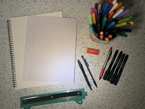
#2: Material Needed
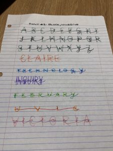
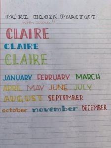
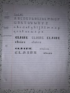
#3: Block Font
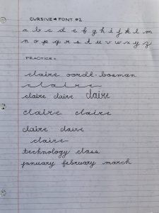
#4: Cursive Font
#5: Block + Cursive Combined Font
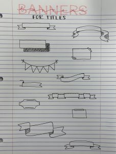
#6: Banners
#7: Doodles
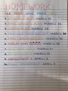
#8: Homework Planner
I got through a decent amount of material and I feel like this was the perfect amount for getting started with lettering. This amount will allow me to master and play around with these fonts and drawings without getting overwhelmed by a hundred different ways of planning my life (and I don’t want to be overwhelmed when I’m trying to organize cause that definitely defeats the purpose). Once I get more comfortable with various fonts, I can just head onto Pinterest to find more!
A few things I learned from this inquiry are that lettering and calligraphy are great ways to add flare and spice to otherwise plain assignments/projects and that there are so many resources online that can help people learn more. I found several Instagram and Youtube accounts of people who do calligraphy and lettering workshops for a living and I would definitely be interested in trying one out. Maybe some day!
Some tips I would give to someone starting out a similar inquiry are that 1. there are endless amounts of fonts – start simple so you don’t get overwhelmed, 2. practice often so you don’t lose your newfound skills and so you can continue getting better, and 3. buy nice materials (this does not necessarily mean expensive – check my materials blog post) so that you feel motivated to try out your cool stuff.
I have really enjoyed learning about this and I’m excited to keep working on different styles.
I’m sad to go but it’s been a blast!
Clogging off forever,
COordt 🙂 <3