
Hey Cloggers,
Did you catch my play on words in my title? 😛
Today, I’m learning my third and final font for this project! I’m excited to get into adding flare and fun into my lettering experience so I’m looking forward to learning this font and getting into banners and doodles next blog. For this font, I’m learning a combination of the block font I learned first, and the cursive font I learned last week. This third font will really start to make me look more capable (and more pro) at lettering and calligraphy #fakenews :P. Below is a picture of me practicing the font and experimenting with different sizes, styles, and colour combos.
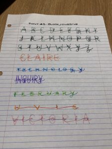
It’s important to note that for this font to work best, the top font (or cursive) has to be more prominent. This means that it should be written in a darker colour/shade than the back font (block font). This font is great for titles because it look strong without being too difficult.
I think that this is my favourite font so far – maybe just because it gives me calligraphy cred.
I’m going to keep practicing all three fonts this week and over reading break so I don’t lose my progress #grind.
Clogging off for now,
COordt 🙂
Leave a Reply
You must be logged in to post a comment.